Disney Channel Logo
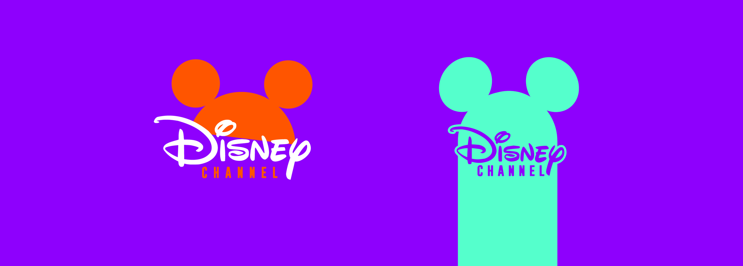
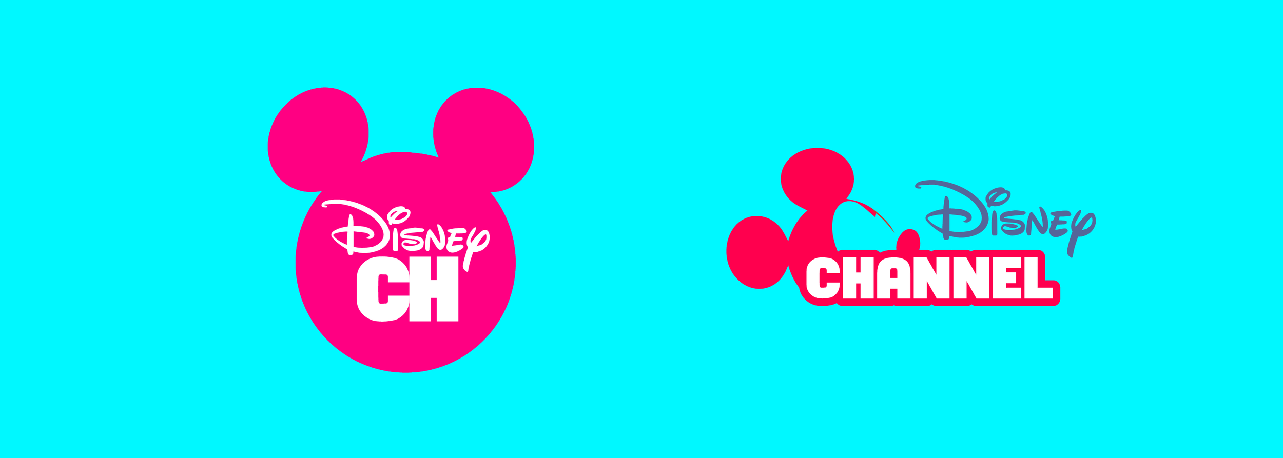
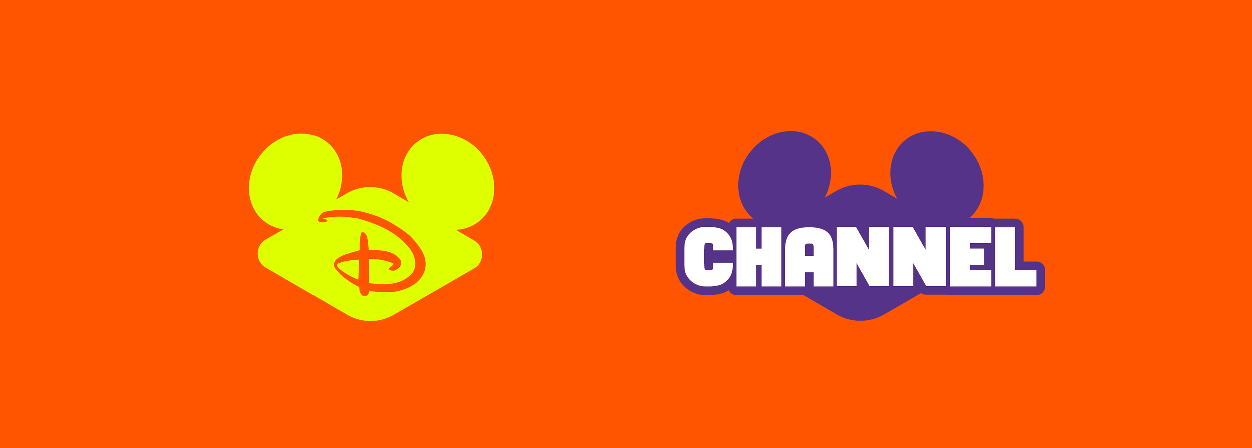
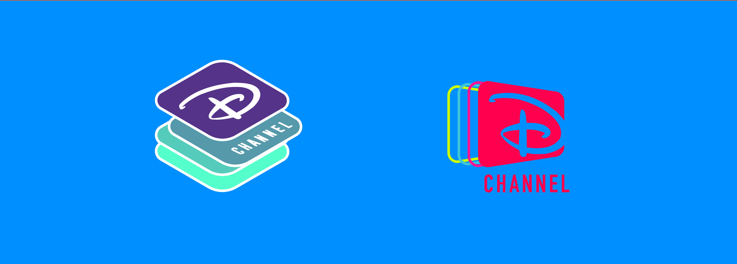
The proposed redesign of the Disney Channel logo takes a bold and dynamic approach, infusing the brand with a burst of modernity and energy. The logo features a sleek and contemporary font that balances sophistication with a sense of fun. The letters are clean and sharp, conveying a sense of professionalism while maintaining a youthful spirit.
The color palette takes a departure from the traditional Disney colors, embracing a range of vibrant fluorescent hues. The background is an electrifying neon blue, representing innovation and excitement. The word "Disney" is rendered in a striking neon green, symbolizing growth and fresh perspectives. The word "Channel" stands out in an eye-catching neon pink, radiating passion and creativity.

Problems
Over time, design trends change, and a logo that once felt fresh and modern might start to look outdated compared to contemporary aesthetics. An old logo could have lost its visual appeal and failed to resonate with modern audiences.
If Disney Channel underwent rebranding efforts, introduced new shows, or shifted its focus, the old logo might not have aligned with these changes. Inconsistencies between the logo and the brand's messaging could dilute the impact of the overall branding strategy.


Logos
The proposed Disney Channel logo redesign with new and fluorescent colors injects the brand with a burst of contemporary flair. The vibrant hues and dynamic typography capture the essence of a channel that's always on the cutting edge of entertainment, while still maintaining a connection to the beloved Disney legacy.
