SmartLife | UX/UI
SmartLife is an innovative app designed to seamlessly control all your intelligent home devices with ease and efficiency. Embracing a clean and modern design, SmartLife addresses the common challenges of managing diverse smart devices by providing a user-friendly solution that streamlines your smart home experience.
Problem
The app tackles the complexity of managing a variety of smart devices from different manufacturers. SmartLife unifies the control of these devices into one intuitive interface, eliminating the need to switch between multiple apps. This centralized control enhances convenience and simplifies smart home management.

Solution
The app tackles the complexity of managing a variety of smart devices from different manufacturers. SmartLife unifies the control of these devices into one intuitive interface, eliminating the need to switch between multiple apps. This centralized control enhances convenience and simplifies smart home management.

User Persona
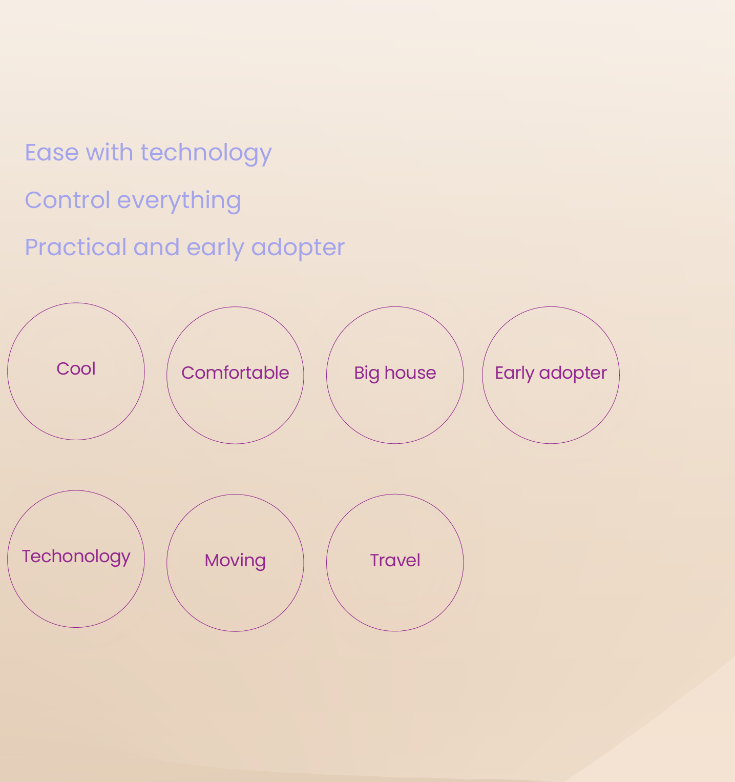
An individual in their late 20s, tech-savvy, and always on the lookout for ways to streamline their busy lifestyle. Mark is intrigued by the concept of a smart home but has been overwhelmed by the hassle of managing multiple device apps.
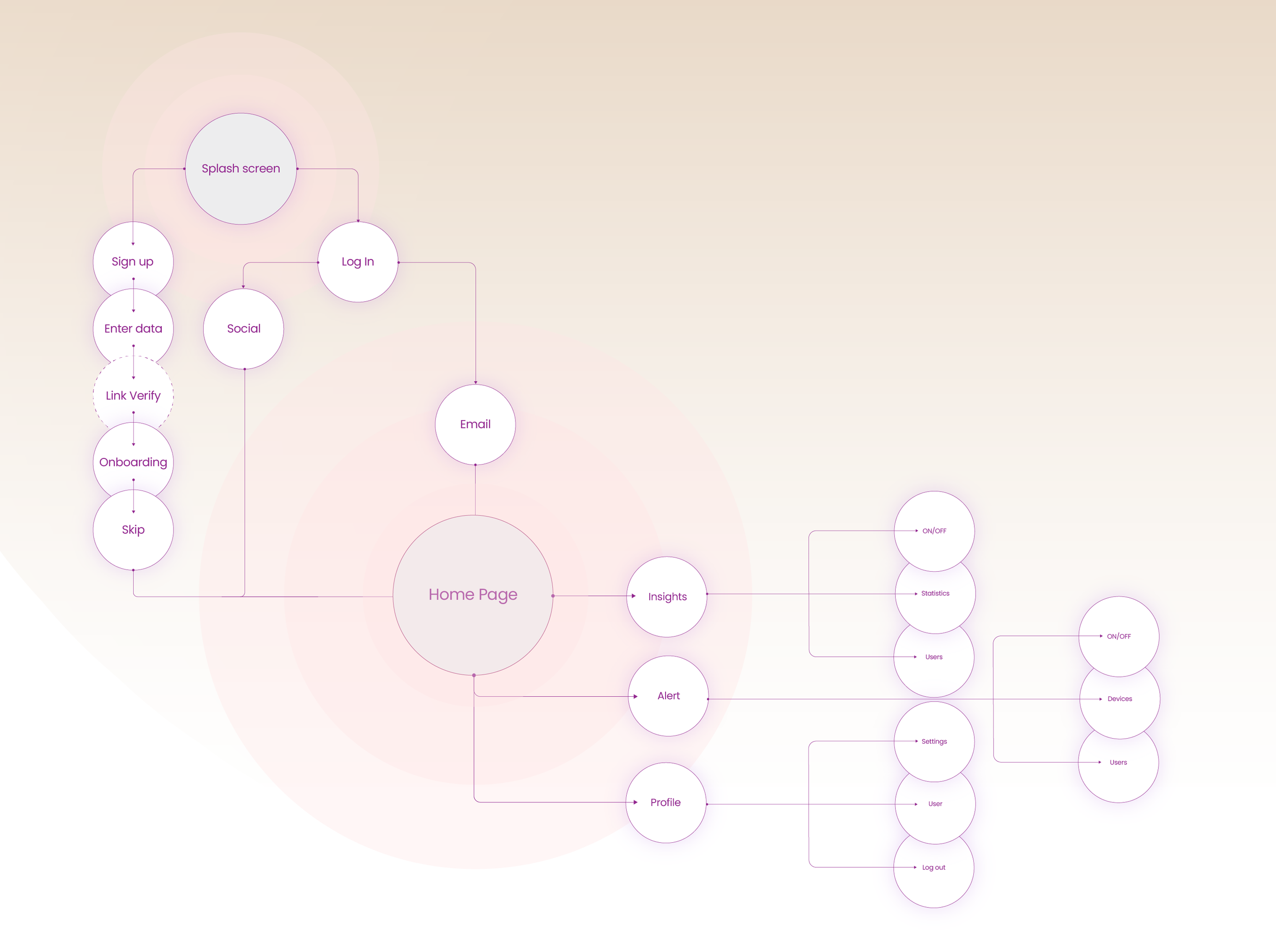
User Flow
Device Setup: Mark installs the app and is guided through a straightforward setup process, connecting his existing smart devices effortlessly.
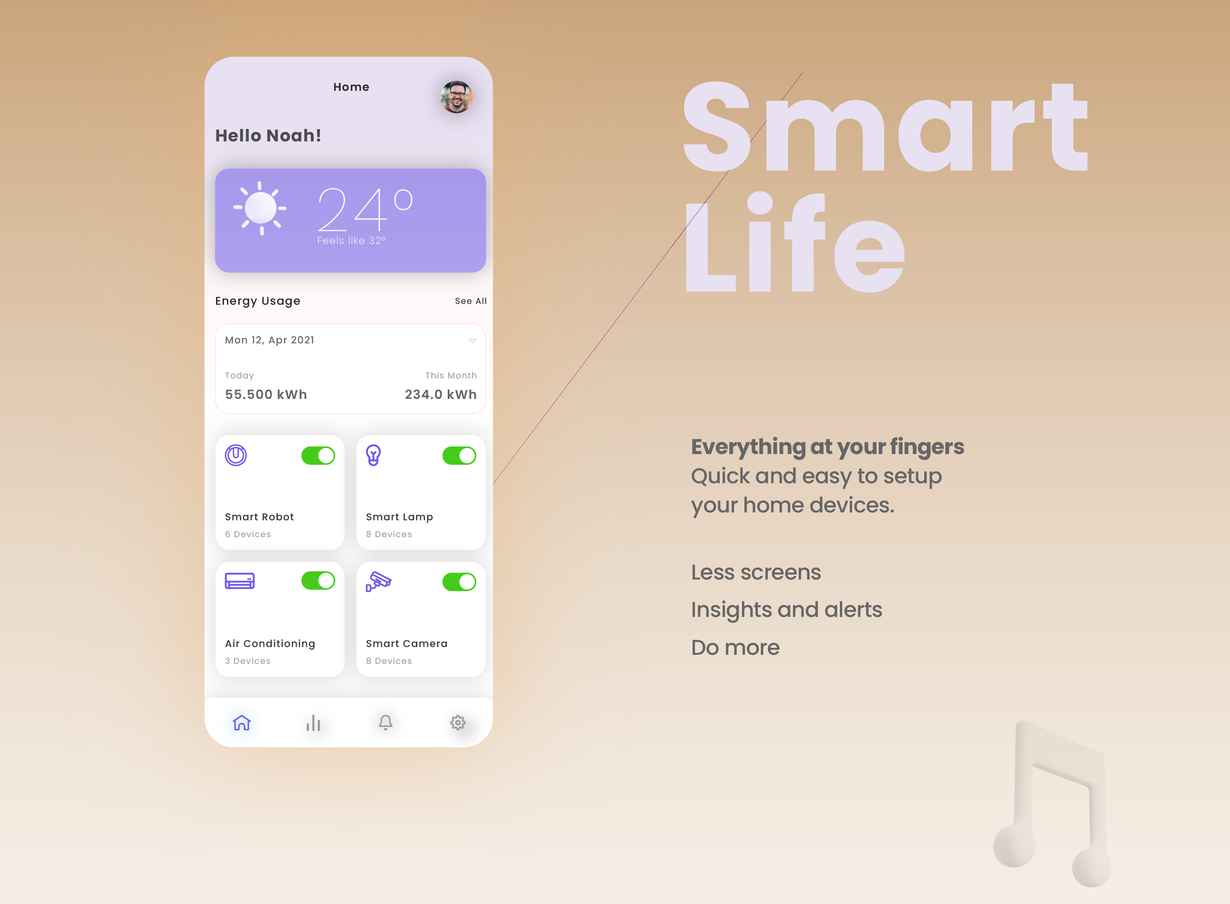
Dashboard Access: Upon setup, Mark is greeted by the app's dashboard that displays all his connected devices and their current status.
Device Control: Mark easily toggles devices on or off, adjusts settings, and monitors energy consumption from within the app.
Scenarios and Automations: The app suggests predefined scenarios based on Mark's routines (e.g., "Good Morning," "Good Night") that he can customize and activate. Mark also sets up automations to optimize his smart home based on specific triggers.
User-Friendly Alerts: If a device needs attention or an automation is triggered, the app sends Mark user-friendly alerts, guiding him to take the appropriate action.
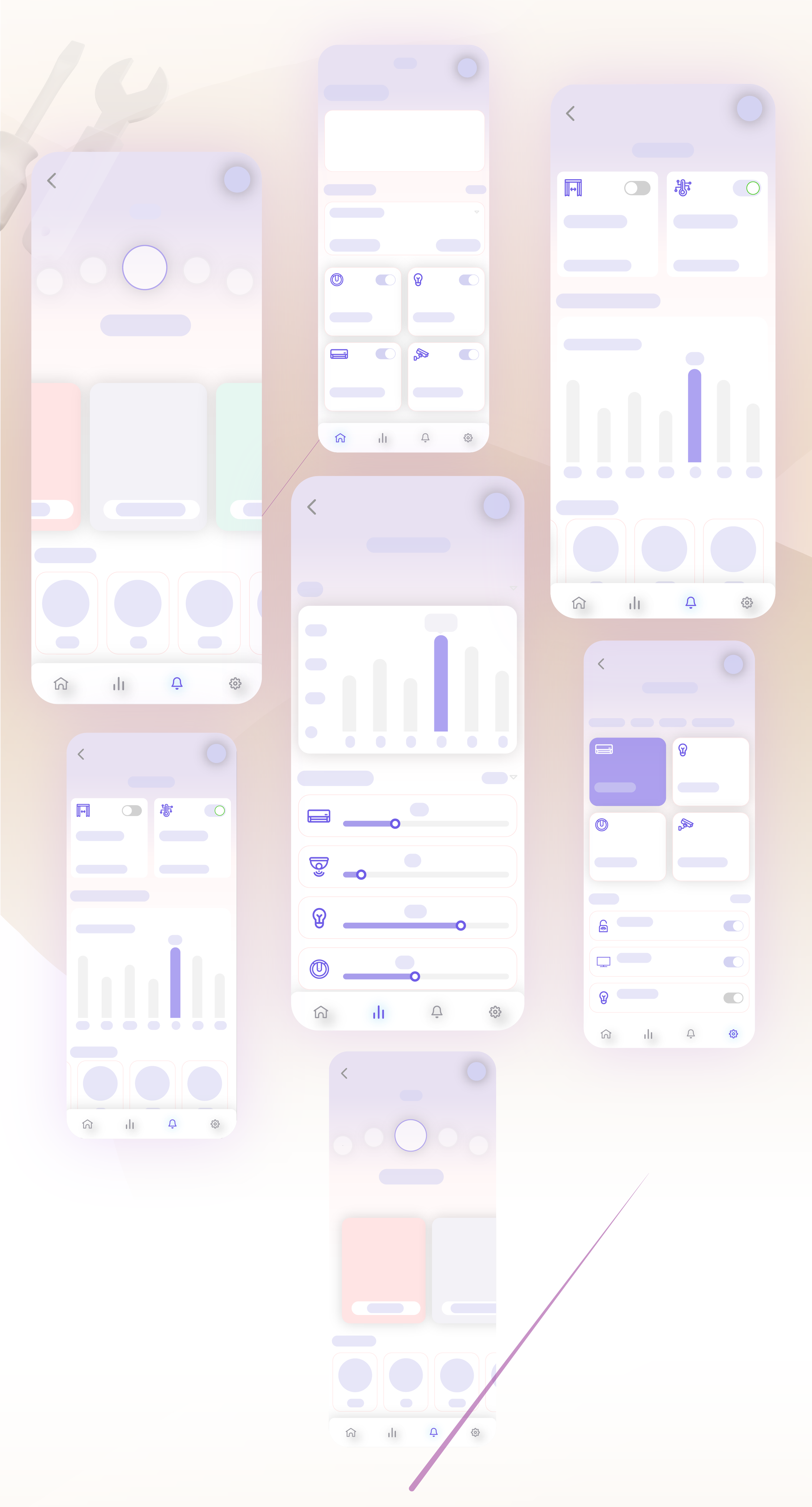
UI Kit
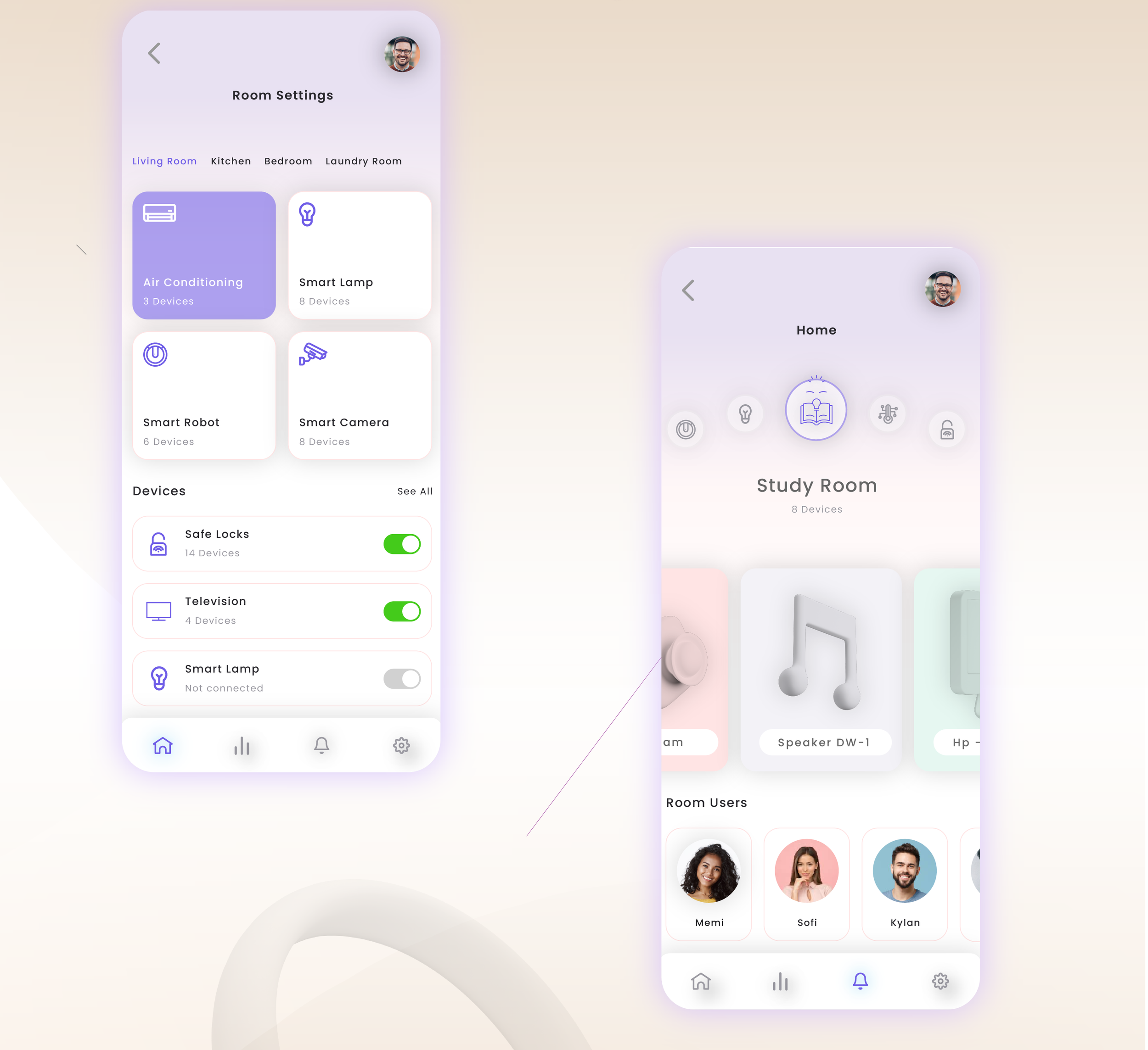
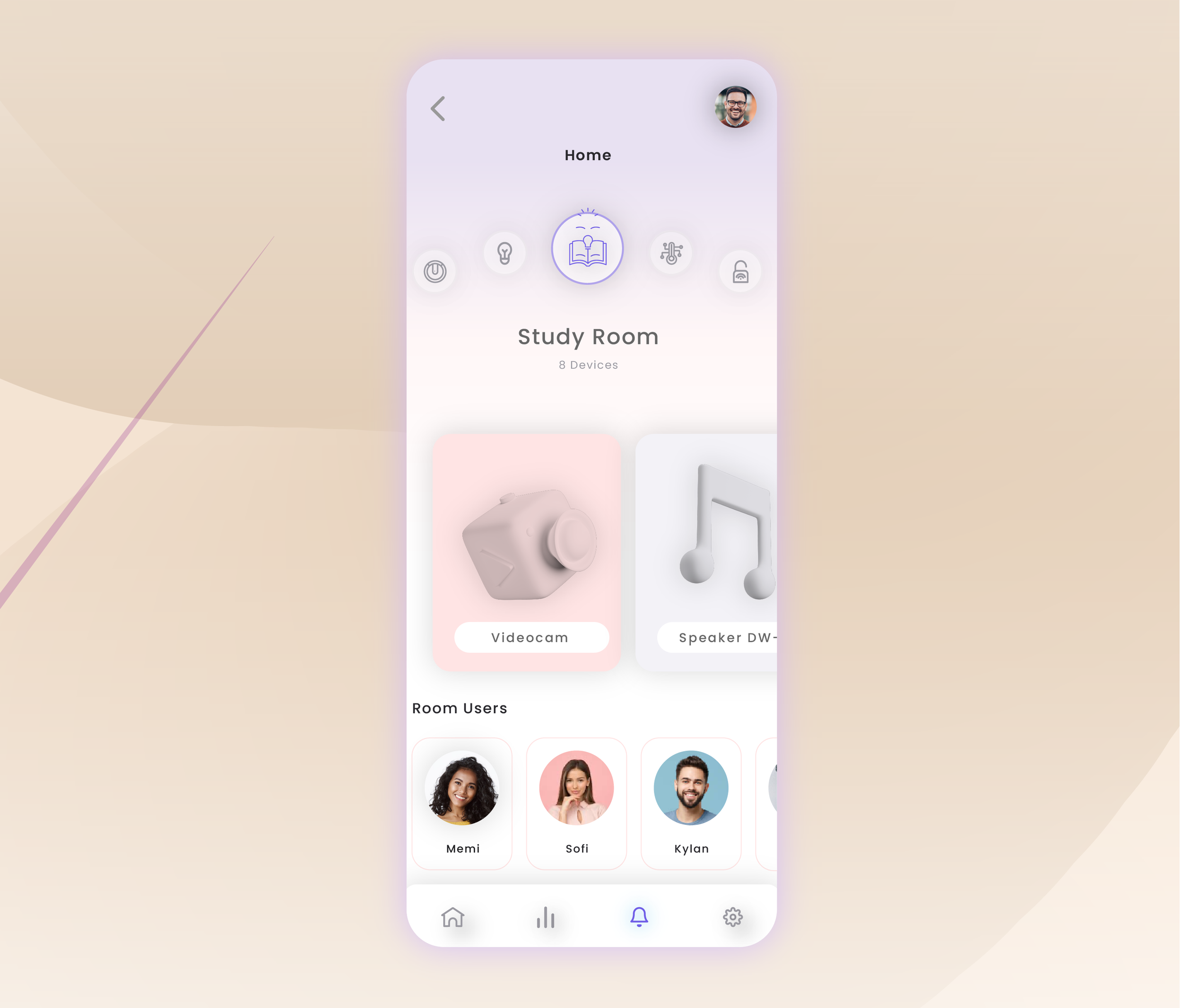
Clean Cards: Each device is presented in a card format with its icon, name, and current status clearly displayed.
Consistent Icons: Uniform icons help Mark quickly identify and differentiate between various devices.
Intuitive Navigation: A bottom navigation bar with icons allows Mark to navigate effortlessly between the dashboard, scenarios, automations, and settings.
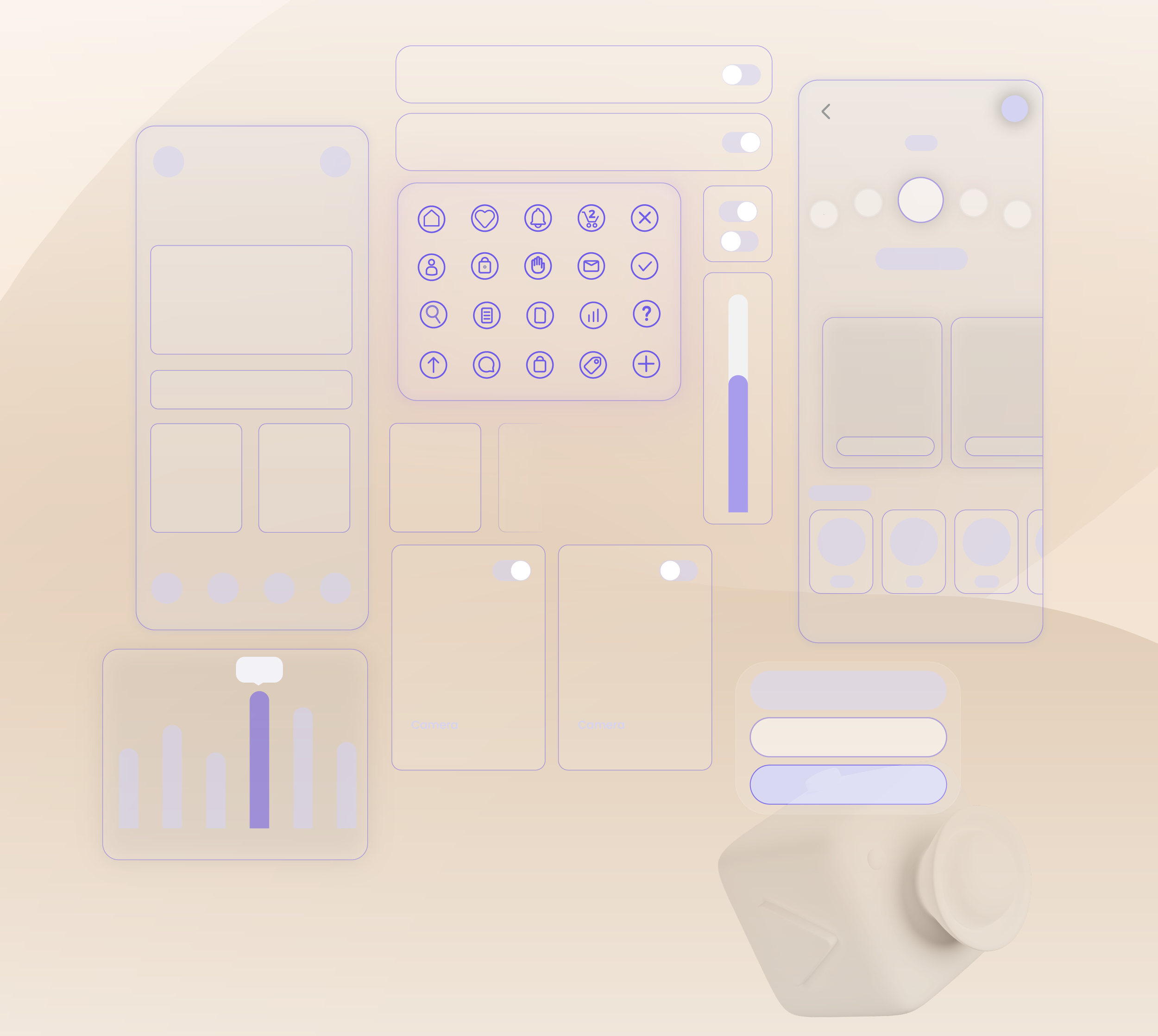
User Flow
Color Palette: A blend of calming neutrals, soft greys, and a pop of accent color (e.g., calming blue or subtle green) communicates a sense of control and modernity.
Typography: A clean and readable sans-serif font ensures clarity and enhances the app's user-friendly aesthetics.


Wireframe
